
https://medium.com/@kj_schmidt/making-a-simple-scatter-plot-with-d3js-58cc894d7c97 Making a simple scatter plot with d3.js KJ Schmidt Follow Feb 20, 2 ...
https://medium.com/@kj_schmidt/making-a-simple-scatter-plot-with-d3js-58cc894d7c97
Making a simple scatter plot with d3.js


Getting started
This tutorial uses d3 v4.6. The CDN is hosted on Cloudflare, so you can start by adding this script tag to your html file:
<script src="https://cdnjs.cloudflare.com/ajax/libs/d3/4.6.0/d3.min.js"></script>
While still in your html file, add a div with an ID (I’m using #scatter in this tutorial) where you’d like the scatter plot to go:
<div id="scatter"></div>
Now onto the javascript. Create a new javascript file for your graph (don’t forget to go back to your html file and add a script tag for it!).
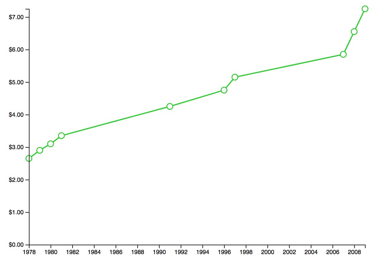
Next, we’ll need some data. We can add this directly to our javascript file. You can add dummy data or use the data I used about the federal minimum wage from United States Department of Labor:
data = [{
     date: 2009,
     wage: 7.25
}, {
     date: 2008,
     wage: 6.55
}, {
     date: 2007,
     wage: 5.85
}, {
     date: 1997,
     wage: 5.15
}, {
     date: 1996,
     wage: 4.75
}, {
     date: 1991,
     wage: 4.25
}, {
     date: 1981,
     wage: 3.35
}, {
     date: 1980,
     wage: 3.10
}, {
     date: 1979,
     wage: 2.90
}, {
     date: 1978,
     wage: 2.65
}]
Get going on the graph
First, we’ll set our variables for margin, width, and height.
var margin = {
     top: 20,
     right: 20,
     bottom: 30,
     left: 40
}width = 700 - margin.left - margin.right;
height = 500 - margin.top - margin.bottom;
Next, we need to format the data. I used d3.timeParse() because my data includes dates. You can also sort your data, which I did from lowest to highest year. Sorting is only important here if you plan to connect your data points.
// format the data
data.forEach(function (d) {
     parseDate = d3.timeParse("%Y");
     d.date = parseDate(d.date);
     d.wage = +d.wage;
});//sort the data by date
data.sort(function (a, b) {
     return a.date - b.date;
});
Now it’s time to set the ranges and scale for our x and y axis. I used .scaleTime() for the x axis since it’s in years, and .scaleLinear() for the y axis since it’s a continuous scale.
var x = d3.scaleTime().range([0, width]);
var y = d3.scaleLinear().range([height, 0]);// Scale the range of the data
x.domain(d3.extent(data, function (d) {
     return d.date;
}));y.domain([0, d3.max(data, function (d) {
     return d.wage;
})]);
This next code establishes what kind of graph we’re making. We’re using d3.line(), which allows us to make either a scatter plot or a line chart.
var valueline = d3.line()
     .x(function (d) {
          return x(d.date);
     })
     .y(function (d) {
          return y(d.wage);
     });
Now we need to append the SVG object to the #scatter div we made earlier in the html.
var svg = d3.select("#scatter").append("svg")
     .attr("width", width + margin.left + margin.right)
     .attr("height", height + margin.top + margin.bottom)
     .append("g")
     .attr("transform", "translate(" + margin.left + "," + margin.top + ")");
Optional: If you want to connect your data points like this, add this code for a trend line:

svg.append("path")
     .data([data])
     .attr("class", "line")
     .attr("d", valueline)
     //styling:
     .attr("stroke", "#32CD32")
     .attr("stroke-width", 2)
     .attr("fill", "#FFFFFF");
*make sure you sorted your data in the format/sort step, or you may have a weird shape here.
Almost done
It’s time to add the actual data points:
var path = svg.selectAll("dot")
     .data(data)
     .enter().append("circle")
     .attr("r", 5)
     .attr("cx", function (d) {
           return x(d.date);
     })
     .attr("cy", function (d) {
          return y(d.wage);
     })
     .attr("stroke", "#32CD32")
     .attr("stroke-width", 1.5)
     .attr("fill", "#FFFFFF");
For both the line and data point code, you can edit the way it looks with the .attr lines.
Lastly, we add the axis. I added some formatting to the y axis to show dollar amounts with .tickFormat(). You can also specify the amount of ticks you want with .ticks().
svg.append("g")
     .attr("transform", "translate(0," + height + ")")
     .call(d3.axisBottom(x));svg.append("g")
     .call(d3.axisLeft(y).tickFormat(function (d) {
          return "$" + d3.format(".2f")(d)
     }));


You have a graph!
If you’re having any issues, see the full code or check it out live.
Interested in adding effects and showing the data point’s value on hover? I have another tutorial for that!