
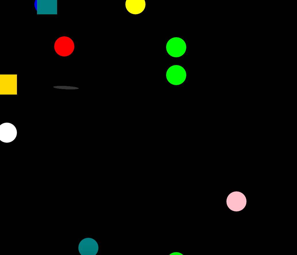
源代碼如下: <!DOCTYPE html><html><head> <title>xi</title> <meta charset="utf-8"> <style type="text/css"> .ww{ width: 70px; height: 70px; background: red; b ...
源代碼如下:
<!DOCTYPE html>
<html>
<head>
<title>xi</title>
<meta charset="utf-8">
<style type="text/css">
.ww{
width: 70px;
height: 70px;
background: red;
border-radius: 50%;
position: absolute;
left: 200px;
z-index: 1;
animation-name: dong;
animation-duration: 0.3s;
animation-timing-function:linear;
animation-direction: alternate;
animation-iteration-count: infinite;
}
@keyframes dong{
0%{top: 100px;}
50%{top:150px;}
100%{top:250px;}
}
.one{
border: 1px solid gray;
height: 10px;
width: 10px;
background: gray;
border-radius: 50%;
margin-top: 220px;
position: absolute;
opacity: 1;
left: 200px;
top:100px;
z-index: 2;
transform:skewX(70deg);
animation-name: yingy;
animation-duration:0.4s;
animation-delay: 0.3s;
animation-iteration-count: infinite;
}
@keyframes yingy{
0%{width: 60px; opacity: 0.8;}
50%{width:70px;opacity: 0.5;}
100%{width:80px;opacity: 0.4;}
}
.tuo{
width: 70px;
height: 70px;
background: lime;
border-radius: 50%;
position: absolute;
left: 200px;
top: 150px;
animation-name: dongz;
animation-duration: 0.4s;
animation-timing-function:linear;
animation-direction: alternate;
animation-iteration-count: infinite;
}
@keyframes dongz{
0%{left: 200px; }
50%{left:500px;}
100%{left:800px; top: 300px;}
}
.tre{
width: 70px;
height: 70px;
background: lime;
border-radius: 50%;
position: absolute;
left: 200px;
top: 150px;
animation-name: donga;
animation-duration: 0.4s;
animation-timing-function:linear;
animation-direction: alternate;
animation-iteration-count: infinite;
}
@keyframes donga{
0%{left: 200px; }
50%{left:500px;}
100%{left:800px;}
}
.uu{
width: 70px;
height: 70px;
background: lime;
border-radius: 50%;
position: absolute;
left: 200px;
top: 900px;
animation-name: dongb;
animation-duration: 0.4s;
animation-timing-function:linear;
animation-direction: alternate;
animation-iteration-count: infinite;
}
@keyframes dongb{
0%{top: 800px; }
50%{top:500px;}
100%{top:200px;}
}
.uu1{
width: 70px;
height: 70px;
background: yellow;
border-radius: 50%;
position: absolute;
left:0px;
top: 0px;
animation-name: dongc;
animation-duration: 1s;
animation-timing-function:linear;
animation-direction: alternate;
animation-iteration-count: infinite;
}
@keyframes dongc{
0%{top:0px;left: 0px;}
25%{top:0px;left: 800px;}
50%{top:800px;left: 800px}
75%{top:800px;left: 0px;}
100%{top:0px;left: 0px;}
}
.uu2{
width: 70px;
height: 70px;
background: pink;
border-radius: 50%;
position: absolute;
left:20px;
top: 20px;
animation-name: donge;
animation-duration: 4s;
animation-timing-function:linear;
animation-direction: alternate;
animation-iteration-count: infinite;
}
@keyframes donge{
0%{top:0px;left: 0px;}
25%{top:0px;left: 800px;}
50%{top:800px;left: 800px}
75%{top:800px;left: 0px;}
100%{top:0px;left: 0px;}
}
.uu3{
width: 70px;
height: 70px;
background: white;
border-radius: 50%;
position: absolute;
left:20px;
top: 0px;
animation-name: dongf;
animation-duration: 1s;
animation-timing-function:linear;
animation-direction: alternate;
animation-iteration-count: infinite;
}
@keyframes dongf{
0%{top:0px;left: 0px;}
25%{top:800px;left: 0px;}
50%{top:800px;left: 800px}
75%{top:0px;left: 800px;}
100%{top:0px;left: 0px;}
}
.uu4{
width: 70px;
height: 70px;
background: orange;
border-radius: 50%;
position: absolute;
left:20px;
top: 0px;
animation-name: dongh;
animation-duration:2s;
animation-timing-function:linear;
animation-direction: alternate;
animation-iteration-count: infinite;
}
@keyframes dongh{
0%{top:0px;left: 0px;}
25%{top:500px;left: 0px;}
50%{top:500px;left: 500px}
75%{top:0px;left: 500px;}
100%{top:0px;left: 0px;}
}
.uu5{
width: 70px;
height: 70px;
background: gold;
/*border-radius: 50%;*/
position: absolute;
left:20px;
top: 0px;
animation-name: dongg;
animation-duration:1s;
animation-timing-function:linear;
animation-direction: alternate;
animation-iteration-count: infinite;
}
@keyframes dongg{
0%{top:0px;left: 0px;}
25%{top:500px;left: 0px;}
50%{top:900px;left: 900px}
75%{top:0px;left: 900px;}
100%{top:0px;left: 0px;}
}
.uu6{
width: 70px;
height: 70px;
background: blue;
border-radius: 50%;
position: absolute;
left:20px;
top: 0px;
animation-name: dongd;
animation-duration: 3s;
animation-timing-function:linear;
animation-direction: alternate;
animation-iteration-count: infinite;
}
@keyframes dongd{
0%{top:0px;left: 0px;}
25%{top:0px;left: 700px;}
50%{top:700px;left: 700px}
75%{top:700px;left: 0px;}
100%{top:0px;left: 0px;}
}
.uu7{
width: 70px;
height: 70px;
background: teal;
position: absolute;
left:0px;
top: 0px;
animation-name: dongl;
animation-duration: 1s;
animation-timing-function:linear;
animation-direction: alternate;
animation-iteration-count: infinite;
}
@keyframes dongl{
0%{top:0px;left: 0px;}
10%{top:0px;left: 100px;}
20%{top:0px;left: 200px;}
30%{top:20px;left: 300px;}
40%{top:50px;left: 400px}
75%{top:600px;left: 0px;}
100%{top:0px;left: 0px;}
}
.uu8{
width: 70px;
height: 70px;
background: teal;
border-radius: 50%;
position: absolute;
left:200px;
top:850px;
animation-name: dongb;
animation-duration: 1s;
animation-timing-function:linear;
animation-direction: alternate;
animation-iteration-count: infinite;
}
@keyframes dongb{
0%{left: 200px; }
50%{left:500px;}
100%{left:800px;}
</style>
</head>
<body bgcolor="black">
<div class="ww"></div>
<div class="one"></div>
<div class="tuo"></div>
<div class="tre"></div>
<div class="uu"></div>
<div class="uu1"></div>
<div class="uu2"></div>
<div class="uu3"></div>
<div class="uu4"></div>
<div class="uu5"></div>
<div class="uu6"></div>
<div class="uu7"></div>
<div class="uu8"></div>
</body>
</html>

